The Morton Arboretum Perennial Report (Annual Report)
UI and UX
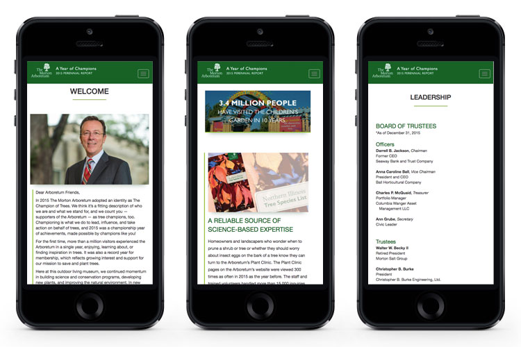
Every year, The Morton Arboretum creates an annual report that highlights significant milestones to communicate the importance of its work as a non-profit organization. The goal of the website was to display information and imagery in an easy to navigate and digest format that would keep the audience's attention throughout the entire site.
Green vertical bars were used to connect the stories and imagery. Section breaker images, key facts, and numbers were used throughout to break up the longer stories to hold people's interest and provide a visual resting point.
In my role for this site, I collaborated with the developer by providing scale mockups in photoshop, sourcing and sizing the imagery, and working together while this was being put into production. We would connect every other day to check on the status of the development, and I would provide input when needed if things were not aligning correctly or items were displaying differently than they were intended to.
Creative Director: Eileen Barrett
Developer: Joe Caruso
Live Site


